When it comes to customizing the colors of your website, the possibilities are endless. However, manually changing every color declaration in your CSS file can be a tedious task. That's where CSS variables come to the rescue, providing a more efficient and flexible solution. In this page, we will explore the power of CSS variables and how they can be used to effortlessly customize the color scheme of our templates.
If you're unfamiliar with CSS variables, consider checking out the following article
Setting Color Variables
In our templates, the color variables are initially set at the very beginning of the main CSS stylesheet inside the :root selector. The :root selector in CSS targets the highest level parent element in the document, which is usually the <html> element. When we declare variables in this selector, these variables become globally available, meaning they can be used anywhere in the stylesheets.
Here's an example of how these variables might be set in the :root seelector in our templates.
:root {
  --background-color: #ffffff;
  --default-color: #444444;
  --heading-color: #0a2a62;
  --accent-color: #1b3bee;
  --surface-color: #ffffff;
  --contrast-color: #ffffff;
}
We can also easily override these global variables in individual sections of the website. For instance, suppose we want to give the "About" section of our website a unique color scheme. We can do so by setting custom colors inside the .about selector. Let's say we want to change the background color and default text color for this section:
.about {
  --background-color: #eaeaea;
  --default-color: #000;
}
Global Colors
Presented below is a detailed breakdown of each color variable we use in our templates.
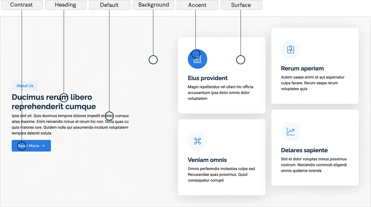
--background-color: - This is the background color of your website, the canvas upon which all elements are laid. This color is applied to the background of the entire website as well as individual sections, creating a cohesive and visually appealing design.
--default-color: - This is the default color used for the majority of the text content. Usually, it's a neutral shade like black or dark grey that provides high contrast against the background for better readability. This is the default color that applies wherever color isn't explicitly set.
--heading-color: - This color is used for titles, headings and secondary elements, providing a hierarchy in the design. While this color is typically less dominant than the accent color, it should still be distinctive enough to draw attention to important content sections, like titles, headings or secondary buttons.
--accent-color: - This is the main accent color that represents your brand on the website. It's used for buttons, links, and other elements that need to stand out. The accent color should be vibrant and in harmony with the overall design, guiding the user's eye through the website's flow.
--surface-color: - The surface color is used as a background of boxed elements within sections, such as cards, icon boxes, or other elements that require a visual separation from the global background color.
--contrast-color: - This is a color used for text when the background color is one of the heading, accent, or default colors. Its purpose is to ensure proper contrast and readability when placed over these more dominant colors. It is generally the inverse or a significantly contrasting shade of the accent or heading color.
Navigation Menu Colors
To ensure a visually appealing and user-friendly navigation experience, we offer separate color variables specifically designed for the main navigation menu.
--nav-color: This is the default color of the navigation links. Typically, it's chosen to contrast well with the navigation bar's background color for visibility. It's applied to all top-level navigation items and sets the standard for the website's navigation aesthetics.
--nav-hover-color: This color is applied to navigation links when they are hovered over by the user's cursor. It sets the color of the text for the hovered link, providing visual feedback to the user and enhancing the interactivity of the navigation menu.
--nav-mobile-background-color: This color is used as the background for the mobile navigation menu.
--nav-dropdown-background-color: This color is used as the background for dropdown boxes that appear when hovering over primary navigation items with sub-items. It's crucial that this color provides enough contrast with the dropdown text color (--nav-dropdown-color) for clear readability.
--nav-dropdown-color: This color is used for the text of the dropdown navigation links, which become visible when a user hovers over or clicks a primary navigation item that has sub-items. This color should be easily readable against the dropdown box's background color (--nav-dropdown-background-color).
--nav-dropdown-hover-color: Similar to --nav-hover-color, this color is applied to dropdown navigation links when they are hovered over. It should provide a clear visual cue to users that they are interacting with the dropdown menu items.
By utilizing these separate color variables for the main navigation menu, you have the flexibility to customize the colors to match your website's overall design. Whether it's the default link colors, hover effects, drop-down menus, or mobile-specific styling, these variables empower you to create a cohesive and visually engaging navigation experience for your website visitors.